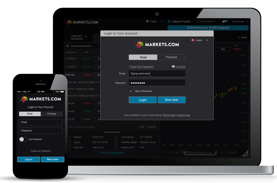
Markets.com |
Forex & CFD Trading Platform
Forec & CFD Traders Around The World | 2015 | Android, IOS, Web | UX/UI, Visual
| Background
Next-Gen Trading at Your Fingertips: Forex & CFD Excellence Across Platforms
One of the world's fastest growing Forex & CFD providers, offering powerful, in-house trading platforms for web and mobile, to trade hundreds of the most popular assets – stocks, currencies, commodities, and indices. It offers advanced research and trading tools, powerful features, an easy-to-use interface, which requires no download.
Optimal Customization for Various Screen Resolutions, Applications, and Platforms.


UI Decision - A Black Dark Colour UI Theme
In the process of building a cutting-edge trading platform from scratch, various options for customizing the system's colors were thoroughly examined. Eventually, the decision was made to adopt a black dark color UI theme. Why?
-
Connecting to Similar World of Content
As it is a convention in stock markets, presenting trading data on blackboards is standard practice. Therefore, it is only natural to align the platform's appearance with this dark colour concept.
-
Luxury & Professionalism
Deep, dark hues evoke a sense of trust and seriousness. The app aimed to strike a balance by being visually appealing and inviting, creating a comfortable and joyful environment that encourages users to register and engage with it.
-
Uniqueness
Selecting a dark visual UI theme added a unique touch to the product, differentiating it from competitors' existing offerings.

Android
iOS
Web
TRADE

Candelstick Pattern
Over 300 Assets
Shares, Indices, Currencies and Commodities
| Solutions
A primary focus was on finding the balance between meeting user's expectations while delivering essential information.
This was accomplished by using big simplistic icons, good hierarchy and a clear call-to-action button.

Hierarchy & Good Balance
Clean & Easy On The Eye
Logical Flow
The use of red or green colors signifies ups and downs, while we opted for a neutral blue to highlight important information.
Ensure users consistently have clarity of their current location, and the possible subsequent steps to be taken.
Simple Navigation
By a simple Tap - traders are directly led to the chosen commodity on the platform without the need for complete registration.

Easy UI Customization
Users can choose their own favorite way to view data- List View or Cards View.

| Challenges
Allow Screen Rotation
Making design adjustments to both portrait and landscape view.
Simplify a Long Process of Filling Personal Details & Clearing Bank Details
In order to allow users to trade for real money, the regulation forces users to enter a lot of personal details into the system in a long form. I had to find ways to make that process easier, for preventing user abandonment, such as creating inviting and readable forms, dividing the form into sections or few stages.


Light Theme UI Customization
At a more advanced stage of the application development, we also added new light white colour theme.


